In the inflatable paddle board industry, graphic design plays a decisive role in shaping brand perception, improving retail visibility, and influencing end-user buying decisions. As iSUP markets grow more diversified-ranging from family leisure boards to touring, racing, fishing, and yoga use cases-manufacturers and brands have started prioritizing distinctive visual identity as much as product durability and performance. Today's iSUP buyers no longer look only at construction, materials, or accessories; they also judge boards by aesthetic coherence, color language, and emotional appeal. This shift has accelerated the emergence of several dominant design trends. Among these, minimalist graphics, pop-art visuals, natural textures, and sporty performance-driven styles represent the four core directions actively shaping global iSUP design in 2025 and beyond.
This article provides an in-depth analysis of each style, discussing design principles, visual language, manufacturing feasibility, and how these graphic trends align with target user groups. It also covers SEO-critical topics such as iSUP printing methods, branding opportunities, EVA deck pad patterns, color management, digital printing control, and the relationship between design style and market positioning. Whether you're a paddleboard brand, OEM buyer, distributor, or creative director working with iSUP suppliers, this guide will help you make informed decisions on how to shape your next collection's visual identity.
1. Minimalist Design: Clean Lines, Balanced Geometry, and Premium Color Palettes
Minimalist iSUP graphics continue to dominate premium categories, especially touring boards, all-around models, and lifestyle-oriented collections aimed at urban users. The minimalist trend emphasizes clarity, visual balance, and brand sophistication. Instead of relying on complex artworks, brands use negative space, thin strokes, structured geometry, and subdued color tones to communicate quality. This design approach works exceptionally well for iSUP surface printing because it reduces the risk of stretching distortion and ensures consistent alignment during heat-transfer or digital printing.
Minimalist boards also resonate with a wide range of buyers who prefer understated elegance over bold visual impact. These designs often adopt monochrome palettes, sand-beige combinations, charcoal greys, navy blues, olive greens, and desaturated earth colors-tones that reflect stability, calmness, and premium craftsmanship. For brands aiming at the higher price segment or collaborating with lifestyle retailers, minimalist graphics can serve as a strategic visual foundation. They also integrate well with modular EVA deck pad designs, such as brushed textures, diamond grooves, or two-tone pads that further enhance the board's refined look.
Minimalism also supports strong brand visibility. With fewer graphic distractions, logos and model names appear clearer and more memorable. This approach is particularly useful for B2B OEM clients who want to create brand identity without investing in complicated artwork. It also reduces printing errors and improves color consistency across large-scale production, which is crucial when producing large B2B orders or maintaining year-round stock availability.
2. Pop Art Style: Bold Contrasts, Energetic Illustrations, and Youth-Oriented Visuals
Pop art–inspired iSUP design is gaining traction among lifestyle brands, water-sports influencers, and companies targeting younger demographics. Characterized by saturated colors, high-contrast layouts, oversized illustrations, and dynamic comic-style strokes, pop-art paddle boards deliver strong shelf presence in retail stores and instantly grab attention on social media. These designs pair well with digital printing, which allows unlimited color combinations, gradient transitions, and high-resolution patterns without increasing MOQ.
One reason for the popularity of pop-art graphics in the iSUP market is the rise of adventure content creators who prioritize visually striking equipment. When a vibrant board appears in travel photos, beach scenes, or surfing videos, the board functions as a lifestyle icon rather than just a product. Brands capitalize on this by integrating electric blues, neon yellows, cherry reds, and high-pop purples-color schemes that amplify the board's visual impact across different environments.
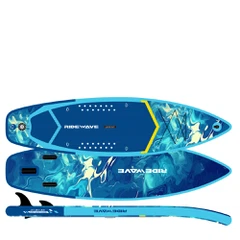
Pop-art iSUPs often incorporate fun illustrations: palm trees, waves, cartoon characters, abstract strokes, or dynamic explosion patterns reminiscent of retro comic panels. These elements create emotional connection and promote a sense of freedom, creativity, and playful energy. At the manufacturing level, pop-art designs benefit from digital printing precision. Because pop-art graphics often require dense pigments and sharp lines, brands must ensure optimal color fastness, UV resistance, and proper lamination quality to avoid fading after prolonged sun exposure. With well-calibrated printing profiles, pop-art paddle boards maintain vibrancy for many seasons, making them ideal for high-impact product lines.
3. Natural Textures: Woodgrain, Stone Patterns, and Organic Color Schemes
Boards featuring natural textures-wood, bamboo, cork, stone, sand, or water-inspired patterns-have established a strong presence in the European and North American markets. Many outdoor enthusiasts prefer boards with organic aesthetics because they blend effortlessly into nature and convey an eco-friendly, calm, and harmonious vibe. In fact, natural-style iSUPs are particularly popular among touring, yoga, and recreational paddling communities who look for visually soothing equipment.
Woodgrain remains the most iconic texture, often inspired by traditional wooden surfboards. Modern printing technology allows factories to produce wood patterns with deep grain detail, subtle gloss, and layered color tones that mimic real timber. When paired with warm brown or olive-green EVA deck pads, wood-style iSUPs achieve a high-end handcrafted appearance without the weight or cost of actual wood construction. These designs typically appeal to buyers who value craftsmanship, sustainability impressions, and aesthetic longevity.
Stone and mineral textures-such as granite, marble, volcanic rock, or sand patterns-are also gaining momentum. These designs convey stability and natural energy, fitting perfectly with brands positioned in eco-touring, fitness paddling, or wellness lifestyles. Natural textures work well with heat-transfer printing because the organic irregularities mask minor alignment differences, making production scalable and reliable.
Another advantage is versatility: natural textures can mix with minimalist elements, brand signature colors, or monochrome logos, creating hybrid styles that remain timeless. For brands that plan long-term product cycles, natural textures reduce the risk of trend fatigue and allow yearly continuity without major redesigns.
4. Sporty Styles: Speed Lines, Technical Graphics, and Performance-Driven Color Coding
Sporty iSUP designs take inspiration from racing boards, competitive water sports, and high-performance gear aesthetics. They feature aerodynamic stripes, speed-inspired gradients, and technical markers that communicate motion and precision. In the fast-growing performance segment-such as race SUPs, long-distance touring boards, and adventure models-sporty graphics help differentiate technical boards from leisure products and emphasize engineering quality.
This style often uses sharp diagonal lines, angular forms, and color-blocking strategies that highlight the board's silhouette. Racing red, carbon black, metallic silver, and kinetic blue are common color choices because they communicate energy and dynamic force. Many brands use a combination of matte and gloss finishes, giving the board a professional athletic appearance.
Sporty styles also play a functional role in segmentation. For example, brands use color coding to distinguish between racing, all-around, and touring models within the same series. This helps retailers and distributors quickly identify product categories, making showroom display and inventory management more efficient. In iSUP manufacturing, sporty designs typically require precise alignment during printing because misalignment can affect the visual flow of speed graphics. High-quality digital printing, improved rail alignment, and strict QC checks ensure the consistency needed for performance-oriented collections.
This style is especially appealing for brands building identity around athletic performance, training programs, paddling clubs, or competitive events. As global interest in SUP racing continues to rise, sporty graphic styles will remain a dominant visual trend in technical product lines.
5. Choosing the Right Design Trend for Your Brand: Market Positioning, Printing Methods, and Material Compatibility
When selecting an iSUP design direction, brands must consider not only aesthetics but also market positioning, customer demographics, printing feasibility, and long-term manufacturing consistency. Each style has a unique relationship with printing technology, material structure, and brand strategy.
Minimalist designs work best for premium lifestyle boards, rental fleets, and all-around collections aimed at broad markets. They offer color stability, easy scalability, and strong brand impact with minimal printing risks. Pop-art styles are ideal for youth-oriented brands, adventure influencers, and retailers seeking high-energy visuals. However, they require excellent UV-resistant inks and precise digital printing capabilities to maintain vibrancy. Natural textures serve brands focused on wellness, touring, and eco-inspired storytelling. These patterns pair well with neutral EVA pads and appeal to users looking for calm, nature-connected aesthetics.
Sporty styles align with performance-driven product lines that highlight board stiffness, hydrodynamic shaping, and athletic features. These designs perform best when combined with heat-transfer or hybrid digital printing to ensure crisp execution of speed lines and angular graphics.
Beyond aesthetics, brands should also consider manufacturing elements such as rail printing alignment, EVA deck pad pattern compatibility, the color behavior of PVC material under sunlight, and MOQ requirements for different printing methods. With proper planning, each design trend can be customized to fit brand identity, price positioning, and production timelines, ensuring visual consistency across the entire product lifecycle.